Home / Statistical Tools / Control Charts / G Chart (Rare Event Control Chart)
G-Chart (Rare Event Control Chart)
From Excel click...
QXL Stat Tools Tab > Control Charts > G-Chart
The G chart is a rare event chart which should be used when the count between times is less than 1.(Wheeler, D. J. "Working with Rare Events." Quality Digest. Quality Digest, Web. 10/28/11.)
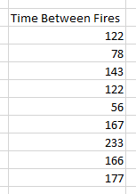
For example, the following dataset reflects the times between fires in a local area. The first data point, 122, indicates that 122 days passed between fires. In this dataset, the count between times is far less than 1.

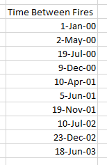
The G Chart is applied to counts between events. The data can be in the number of time periods between events as above, or you can enter the date the event occurred. For example, the above data can be also be expressed with this dataset.

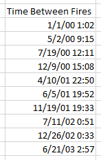
When using dates instead of counts, Quantum XL uses "Days" as the count event. Note that the first date (1 Jan 2000) establishes the first event. The second date (2 May 2000) occurred 122 days later. The G-Chart should not be confused with the T-Chart. The G-Chart is used when the time between events is a count. The T-Chart is used when the time between events is a measurement (continuous). For example, in the example above, we know that a fire occurred on 1 Jan 2000, but not the exact time. If we had the exact time of the fire, then we could use a T-Chart instead. The following data would be appropriate for a T-Chart instead of a G-Chart. In the example below, the time between fires isn't a simple count, rather a measured value between events.
