Home / Statistical Tools / Analysis Tools / Histogram
Histogram
From Excel click...
QXL Stat Tools Tab > Analysis Tools > Create Histogram
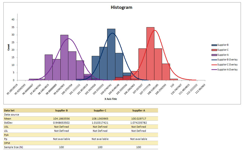
A Histogram is a graph which is used to determine the distribution of a set of data. The data is grouped into classes (bins) of fixed width. For each data point that falls into the class, you increment the count of that class. You can also overlay a curve, display specification limits and statistics: Ppk, Pp, DPM (defects per million).
Step #1: Select data source for Histogram.
Data for the Histogram can come from an Excel spreadsheet or SQL data source. See source data formats.
Step #2: Histogram settings
Settings allow you to change chart titles, select overlay type and control the number of bins and bins width.
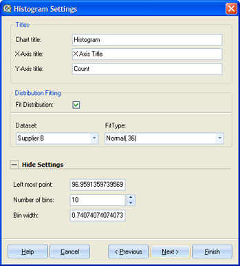
When you check the 'Fit Distribution' check box, Quantum XL will automatically determine the distribution that best fits your data. You can override that by selecting a different distribution in the "Fit Type" drop down list. This list displays all distributions that have p-value > 0.05 for the given dataset. See distribution fitting for more information.
You can override the number of bins for the histogram by changing value in 'Number of bins' text box. If you change this value, Bin width will be recalculated, and vice versa: if you change the Bin width, Number of bins will be recalculated.
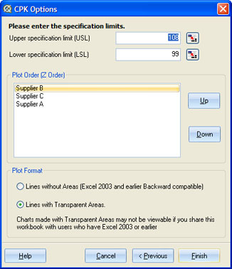
Step #3: Histogram options
Histogram Options allow you to define specification limits, the plot order (when there is more than one dataset plotted on the same chart), and fill type for the histogram bars.
-
Specification Limits - You can either directly enter the USL and LSL or you can use the link button (
 ) to link the value to a cell. Specification limits are displayed as red lines on the graphs. Bins and curved areas left of the LSL and right of the USL lines are also colored in red.
 -
Plot order - When there is more than one dataset on the chart, you can control which dataset is displayed on top.
-
Plot format - Excel can display transparent bars. This allows you to see all plotted data, regardless if bars overlap.
-
Statistics - Statistics for Histogram are displayed in the table below the Histogram chart.
Update
Histogram chart is updatable. After you create a Histogram , you can change it's settings, change data source or add new data to data source and simply update chart.
- Update Histogram chart: Quantum XL > Statistical Tools > Update Sheet
- Change settings: Quantum XL > Statistical Tools > Modify Chart/Analysis
- Change data source: Quantum XL > Statistical Tools > Change data source
Histogram Example