Home / Monte Carlo / Latitude Plots / Understanding Latitude Plots
Interpreting Latitude Plots -- Part III
From Excel click...
QXL Monte Carlo Tab > Contribution Tools > Latitude Plots
This is the third article in a series that covers Latitude Plots. Links to the previous articles are below.
Part I -- Understanding Latitude Plots
Part II -- Understanding Latitude Plots
In the first article, Understanding Latitude Plots, we introduced Latitude Plots and discussed the basics. In the second article, Understanding Latitude Plots Part 2, we expanded the models to include more than one output and demonstrated how Latitude Plots and optimization work together. If you have not read the introductory articles, I recommend that you do so.
In this article, I am going to explain how to interpret Latitude Plots. The interpretation is not complex but can be used to communicate with others. Latitude Plots fall into one of several board categories. They are :
1. Ideal Latitude Plots
2. Excessive Variation
3. Off Center Inputs
4. Too Expensive/Money Left On the Table
Ideal Latitude Plots
A Latitude Plot is a visual representation of the expected variation vs. the latitude window. In the ideal state, we would have plenty of room for the entire expected variation within the window. Graphically, this would look like the plot below. The expected variation window fits comfortably within the latitude window.
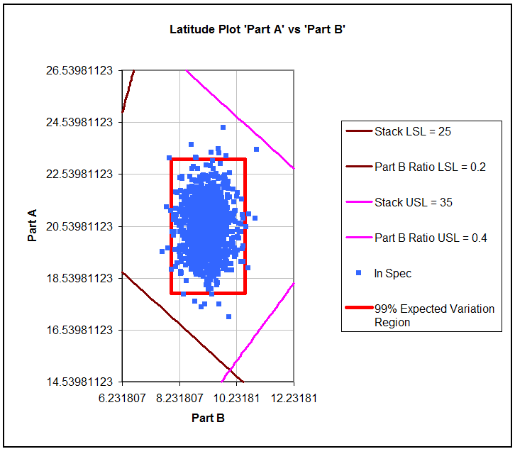
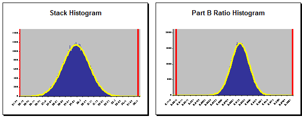
The Monte Carlo Simulation results for the Latitude Plot above are shown below. Note that nearly all of the outputs would fall in spec. The dpm for both of these outputs is less than 2.
Excessive Variation
In the Latitude Plot below we have a problem. This problem is normally expressed in one of two ways.
Explanation #1: The inputs have too much variation.
Explanation #2: The specification limits are too tight (the latitude window is too small).
Fundamentally, they are two different views of the same problem. When compared to the latitude window, the process has too much variation.
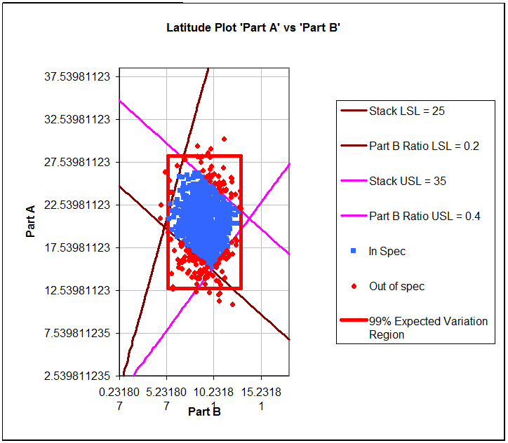
The Monte Carlo simulation results for this model are shown below. As expected, both outputs have significant defects.

The solution to this type of a problem usually falls into one of these categories :
-
Variance Reduction -- Implementing some variance reduction methodology such as Six Sigma or Design for Six Sigma (DFSS).
-
Sorting the inputs -- Finding pairs of Part A and Part B that will combine to create a stack in specification. This is usually referred to as "sorting" but has other names such as "non-random assembly". Sorting is usually considered to be cost prohibitive.
-
Opening the specification limits -- If the specification limits are tied to a customer requirement, this is usually not a good idea. On the other hand, if the specification limits were set arbitrarily, there might be some room to widen the spec limits.
-
Redesign -- Changing the nature of the design so that the stack height is either easier to obtain or no longer pertinent. This solution can vary widely from adding another part to changing the underlying technology.
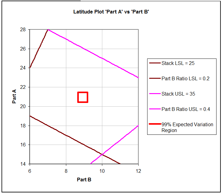
Off Center Inputs
The Latitude Plot below is a good example of an off center process. The current average value for both Part A and Part B is too large; if they were both reduced, the expected variation window would fall closer to the center of the latitude window.
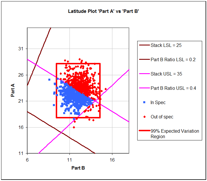
The matching Monte Carlo simulation histograms for this model are shown below.
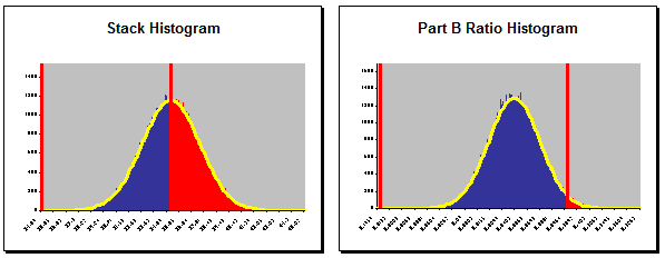
The first approach to this problem is usually optimization (sometimes called Parameter Design). Optimization involves shifting the mean of the inputs to center the expected variation region on top of the latitude window.
Too Expensive/Money Left On the Table
The last example is one in which you have excessive latitude. The expected variation region (red box) is exceptionally small when compared to the total latitude window.
Below are the histograms from the Monte Carlo simulations. Note that both outputs are well within the specifications.
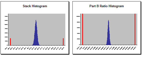
While this is a good problem to have, in most cases this will result in a design that could be reduced in cost (also known as a "Cost Down"). It would be worth investigating if less expensive raw materials could be used to make the product. The lower cost materials would likely have more variation; but with the large window available, we will likely be able to use the cheaper materials.
Conclusion
Latitude Plots provide a visual representation of the expected variation region compared to the available latitude window. While views of histograms provide a clear understanding of the distribution of the outputs, they do not show how this relates to the inputs. Using latitude plots you can obtain a better understanding of the relationship between the inputs and the outputs.