Home / Monte Carlo / Latitude Plots / Multiple Inputs and Latitude Plots - Part IV
Multiple Inputs and Latitude Plots - Part IV
From Excel click...
QXL Monte Carlo Tab > Contribution Tools > Latitude Plots
This is the fourth article in a series that covers Latitude Plots. Links to the previous articles are below.
Part I - Understanding Latitude Plots
Part II - Understanding Latitude Plots
Part III - Interpreting Latitude Plots
Latitude Plots are a visual representation of the expected variation region (of the inputs) as compared to the latitude window (of the outputs). While histograms are output centric, latitude plots are input centric. While histograms are designed to give a graphical view of the outputs, latitude plots are designed to give a graphical view of the inputs. The table below summarizes the differences between histograms and Latitude Plots.
| Histograms | Latitude Plots | |
|---|---|---|
| Inputs | The variation from all inputs are represented in a Histogram. The number of inputs does not affect the number of Histograms. | Two inputs (each pair) are represented in a Latitude Plot. An increase in the number of inputs leads to more Latitude Plots. |
| Outputs | Only one output is represented in a Histogram. There is one Histogram for each output. | All outputs are represented in a single Latitude Plot. The number of outputs does not affect the number of Latitude Plots. |
To illustrate this, we will add an input to the stack example used in Part III of this series.
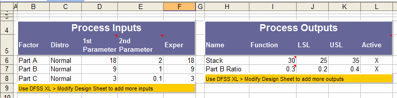
We now have three parts (inputs) and the same two outputs; Stack and Part B Ratio. The Stack Height is now the sum of all three Parts, that is Stack = Part A + Part B + Part C. When we create a Latitude Plot with these three inputs, we get the following plots. Note that there is one Latitude Plot for each pair of inputs. Therefore, we get a plot of Part A vs. Part B, Part A vs. Part C, and Part B vs. Part C.
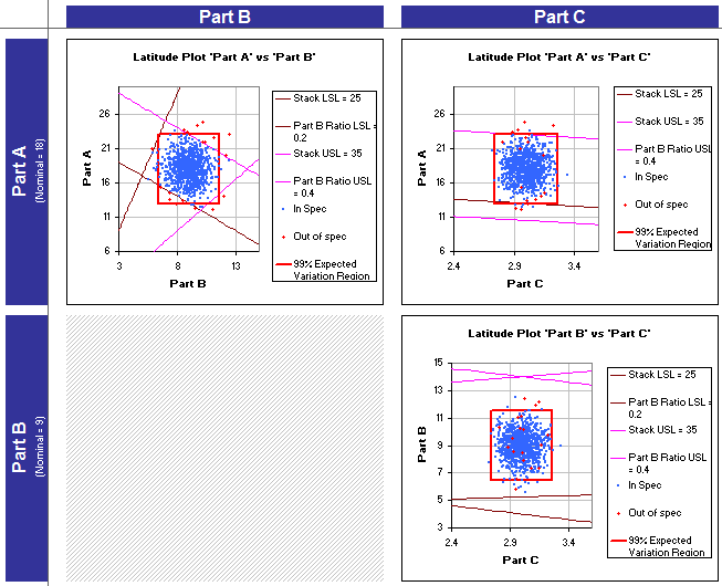
If we had four parts, instead of three plots Quantum XL would have created six plots by default: A vs. B, A vs. C, A vs. D, B vs. C, B vs. D, and C vs. D. As the number of total plots increases quickly, Quantum XL allows you to exclude inputs to reduce the total number of plots.
For this example, I want to focus on the latitude plot of Part A vs. Part C; it is shown below. One of the first things that jumps out is that there are red dots within the Expected Variation Region.
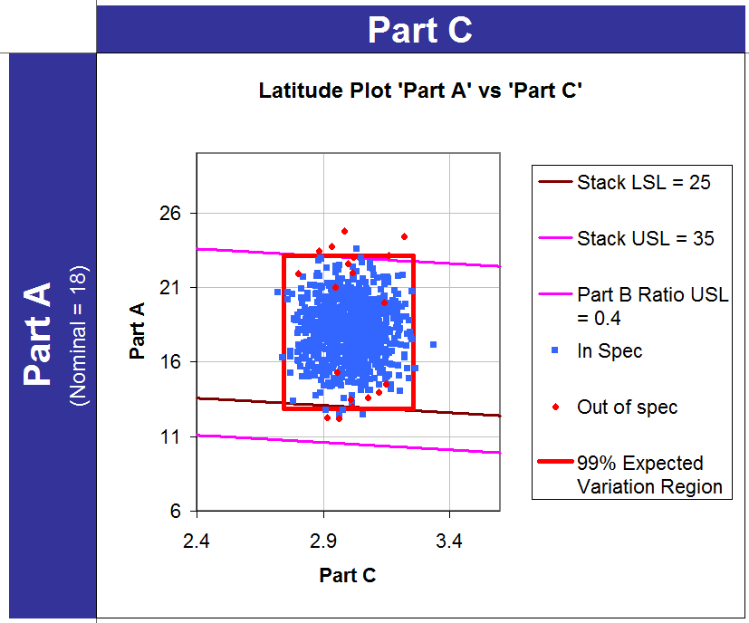
How Can Red Dots Be Inside the Expected Variation Region?
Probably the #1 question when people start working with Latitude Plots is, "How can red dots be inside the red box?" The answer is quite simple: This Latitude Plot describes the variation in Part A and Part C; however, it does not depict the variation in Part B. In order to demonstrate this, let's focus on one of the red dots within the expected variation region.
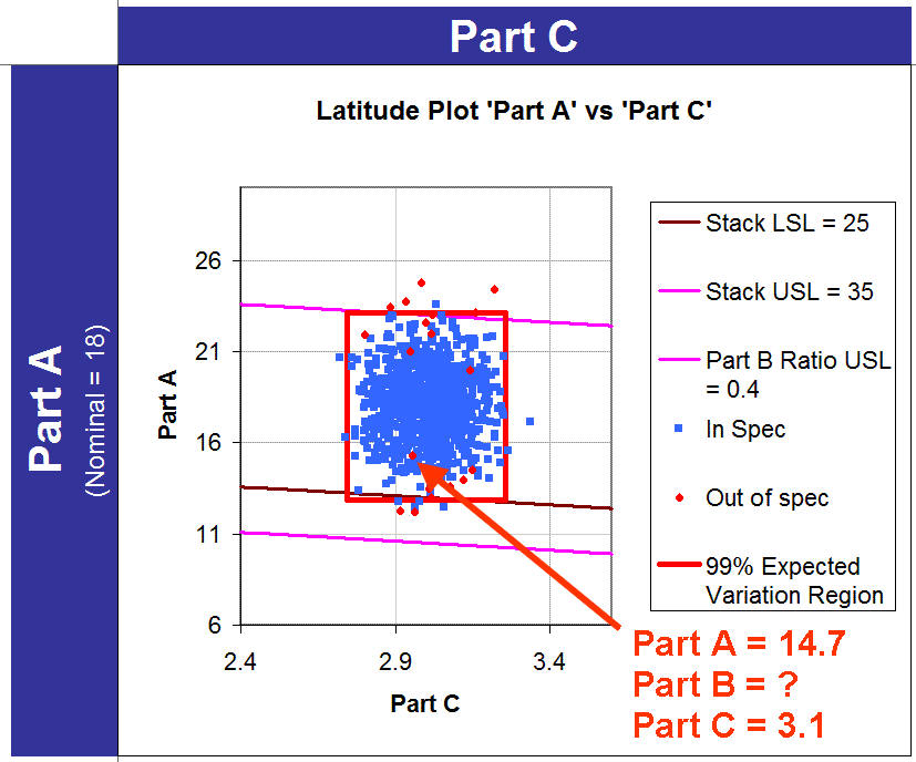
The value for Part A and Part C can be extracted based on where the red dot falls in X,Y space. However, we can't ascertain the value of Part B from looking at the graph. Remember that the Stack = Part A + Part B + Part C. Any stack heights less than 25 or greater than 35 are out of specification. It turns out that if we were to look at the raw Monte Carlo data for this simulation, Part B is equal to 6.5, making the stack = 14.7 + 6.5 + 3.1 = 24.3. As 24.3 is lower than the LSL this simulation is colored red. A corollary to this observation is that blue dots can be outside of the red box.
What is the purpose of the Red Dot?
The red dots serve several purposes. They serve as a visual indication of the existence of defects. If you see a larger proportion of red dots than you would like, then you know defects are coming from somewhere. They also help you identify which side of the lines are in spec and out of spec. Finally, if you see red dots inside an expected variation region, it is a sure bet the variation from some other input is causing issues.