Home / Statistical Tools / Analysis Tools / Scatter Plot
Scatter Plot
From Excel click...
QXL Stat Tools Tab > Analysis Tools > Scatter Plot
Scatter Plot graphically shows the relationship between two variables. The data is displayed as a collection of points. Each point is determined by the values of two variables, one representing horizontal axis values, and the second representing vertical axis values.
Step #1: Select data source for Scatter Plot
Data for the Scatter Plot analysis can come from an Excel spreadsheet or SQL data source. See source data formats.
If your dataset has more than one column, Quantum XL will create charts for each combination of columns and align them vertically.
Step #2: Scatter Plot Settings
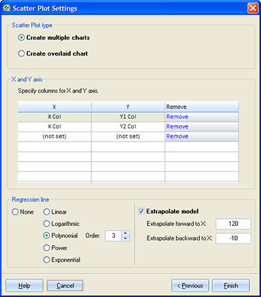
Scatter Plot Type
Quantum XL will create multiple scatter plots if there are more than two columns of data. It is also possible to create a single scatter plot where multiple data columns are overlaid on the same graph.
X and Y Axis
You can choose which data columns will be used for X and Y axis. If the 'multiple charts' option is selected, Quantum XL will create one plot for each pair of the selected columns. If the 'overlaid chart' option is selected, Quantum XL will create a single scatter plot for all pairs of the selected columns. Note that X-axis columns should have the same data type. Otherwise, Quantum XL will create a separate plot for each X axis with different data types.
This option is not available if data source is 'Group by'.
Regression Line
A regression line is a 'best fit' line for two datasets on the scatter plot. The regression line comes as close as possible to the points. The line is drawn on a scatter plot as a continuous line in the same color as the data points.
Quantum XL supports the following regression lines:
| Regression line | Regression equation |
|---|---|
| Linear | 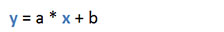 |
| Logarithmic | 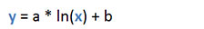 |
| Polynomial (from 2nd to 6th order) | 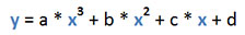 |
| Power | 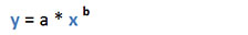 |
| Exponential | 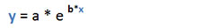 |
Extrapolate
If the 'Extrapolate model' option is checked, Quantum XL will draw a dotted line that goes beyond the existing data. It uses a regression equation to calculate values outside of the known data points. The Extrapolated line has two segments. The first segment starts at the value in 'Extrapolate backward to X' text box (if provided) and goes to the minimum of the known data. The second segment starts at the maximum of the known data and ends at the value in 'Extrapolate forward to X' text box (if provided).
Output
Quantum XL displays the following information for the scatter plot analysis:
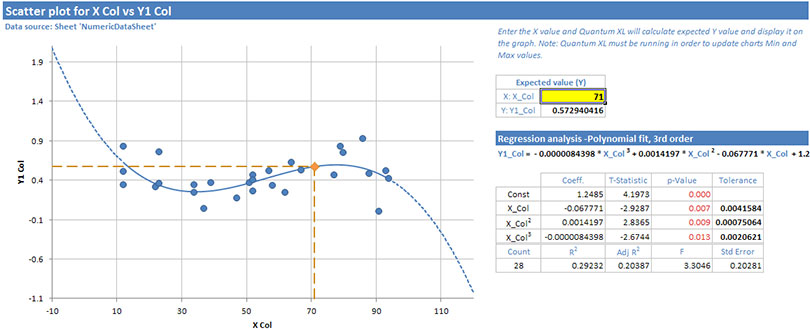
- Scatter plot chart. There will be a separate chart for each X/Y pair of columns, or data will be overlaid on a single chart if the 'Overlaid' option is selected.
- Expected Value fields. Enter the X value in the yellow field, and Quantum XL will calculate expected Y value. The expected data point will be displayed on the graph. In case the expected value is out of the plot range, Quantum XL will automatically update the chart's min and max values. If Quantum XL is not running, the marker for the expected value will not be visible on the scatter chart.
- Regression equation.
- Table with regression statistics.
For each term in the equation, Quantum XL displays:
- Coeff. - The coefficient for the term.
- t-Statistic - The t-Statistic is a term's coefficient divided by its standard error. A simple way to understand this is that the t-Statistic is approximately equal to the number of standard deviations the coefficient is from zero. The t-statistic is used to calculate the probability that the coefficient is non-zero. The result of that calculation is displayed in the p-value.
- p-Value - The p-value is the alpha risk or the probability of committing a Type I error. A Type I error has occurred if you conclude that the coefficient for this term is non-zero when in fact it is not. Most people use .05 as the threshold for significance. If the p-value is less than .05, then they conclude that the term is non-zero and belongs in the model. Note that there is no universal standard indicating that .05 is the threshold. Some researchers will use substantially higher p-values such as .1 or even .25.
- Tolerance - Tolerance is a measure of multi-collinearity. Tolerance is related to the Variance Inflation Factor (VIF) using the equation Tolerance = 1/VIF. A tolerance = 1 indicates that a design is perfectly orthogonal. Tolerances for an individual factor that are less than 1 indicate that the factor is partially aliased with other term(s).
Regression statistics for the model:
- Count - Number of data points (X/Y pairs) used in calculating regression.
-
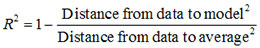
R² - R Squared is Coefficient of Determination. Some define Rsq as "The percent of variation in the data that can be explained by the model.". Thus, if Rsq = 1, then 100% of the variation in the data can be explained by the model (i.e. perfect fit). If RSq = 0, then 0% of the variation can be explained by the model. This would be expected if X was unrelated to Y. Care must be exercised with Rsq as models can be easily overfit. If you add terms to a model, the Rsq value will increase.
-
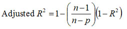
R² Adj - R Squared adjusted for degrees of freedom.
-
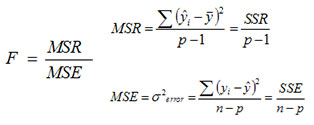
F - The strength of the model (larger is better).
-
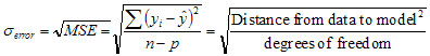
Std Error - The variation in the data about the model.
Update
Scatter Plot is updatable. After you create a Scatter Plot analysis, you can change its data source or add new data to the data source and simply update the chart.
- Update Scatter Plot: Quantum XL > Statistical Tools > Update Sheet
- Change data source: Quantum XL > Statistical Tools > Change data source
- Change settings: Quantum XL > Statistical Tools > Modify Chart/Analysis