Home / Statistical Tools / Analysis Tools / Pareto / Examples / Multiple Categories
Multiple Categories
When you have multiple category columns, Quantum XL creates a separate Pareto chart for each column, allowing you to analyze different dimensions of your data.
Goal
Create Pareto charts for both defect type and production line, showing which categories are most common in each dimension.
Sample Data
Download Pareto_MultipleCategories.xlsx
Excel Protected View
When you open downloaded files, Excel displays a Protected View warning. You must click Enable Editing before you can use Quantum XL with the file.

Alternatively, you can copy the sample data from the table below and paste it directly into a new Excel workbook.
| Defect Type | Line |
|---|---|
| Scratch | A |
| Dent | B |
| Scratch | A |
| Crack | A |
| Scratch | B |
| Dent | A |
| Scratch | B |
| Chip | A |
| Dent | B |
| Scratch | A |
Each row represents one defect observation with two attributes: the defect type and the production line where it occurred.
Steps
-
Launch the analysis
From the Excel ribbon, select QXL Stat Tools → Analysis Tools → Pareto.
-
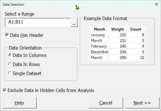
Select your data
Select cells A1:B11 (the header row plus all 10 data rows).
-
Configure the analysis
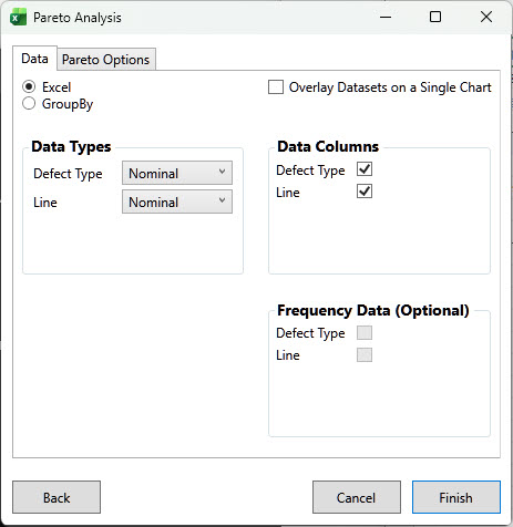
In the Pareto Analysis dialog:
- Data Columns: Leave "Defect Type" and "Line" checked
Click Finish to generate the charts.
Result
Quantum XL creates two Pareto charts:
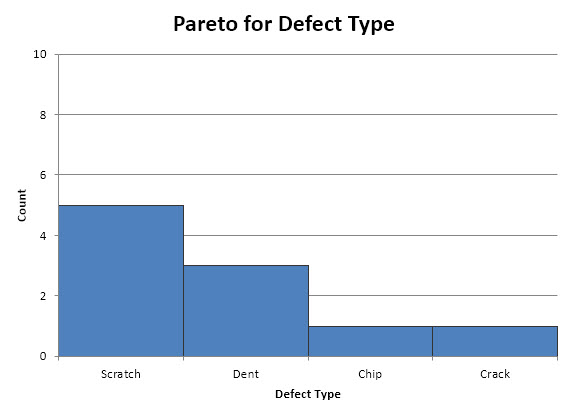
Defect Type chart — Shows Scratch as the most common defect (5 occurrences), followed by Dent (3):
Line chart — Shows the distribution of defects across production lines A and B:
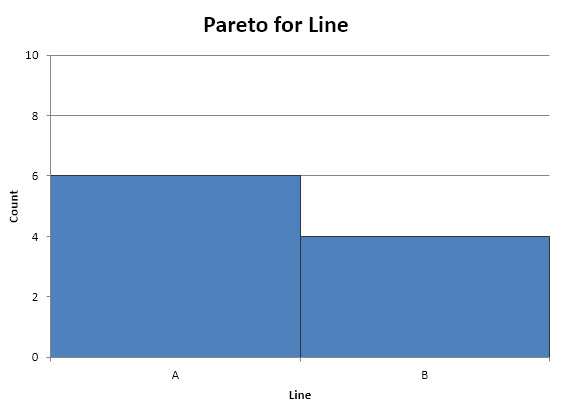
This lets you answer two questions at once: "Which defects occur most often?" and "Which lines have the most defects?"