Home / Statistical Tools / Analysis Tools / Pareto / Examples / GroupBy
GroupBy
Use GroupBy to create separate Pareto charts for each segment in your data, making it easy to compare defect patterns across production lines, shifts, or time periods.
Goal
Create separate Pareto charts for each production shift, comparing which defects are most common on each shift.
Sample Data
Excel Protected View
When you open downloaded files, Excel displays a Protected View warning. You must click Enable Editing before you can use Quantum XL with the file.

Alternatively, you can copy the sample data from the table below and paste it directly into a new Excel workbook.
| Defect Type | Shift |
|---|---|
| Scratch | Day |
| Dent | Day |
| Scratch | Night |
| Crack | Day |
| Scratch | Day |
| Dent | Night |
| Crack | Night |
| Chip | Day |
| Scratch | Night |
| Dent | Day |
Each row represents one defect observation tagged with the shift when it occurred.
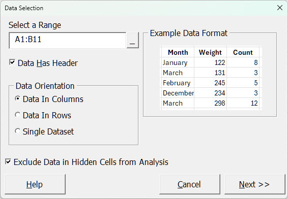
Steps
-
Launch the analysis
From the Excel ribbon, select QXL Stat Tools → Analysis Tools → Pareto.
-
Select your data
Select cells A1:B11 (the header row plus all 10 data rows).
-
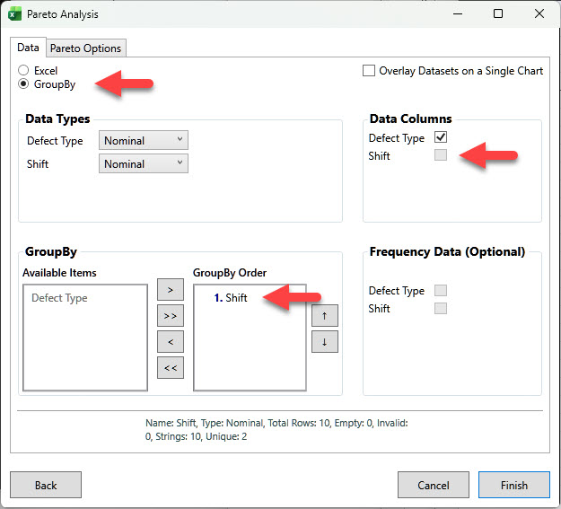
Configure the analysis
In the Pareto Analysis dialog:
- Select the GroupBy radio button (instead of Excel)
- Data Columns: Uncheck "Shift"
- GroupBy: Move "Shift" to the GroupBy Order list
Click Finish to generate the charts.
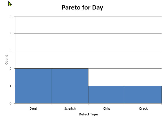
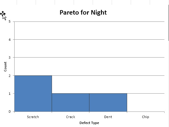
How GroupBy Works
When you add a GroupBy column, Quantum XL creates a separate chart for every unique value in that column. In this example, the "Shift" column has two unique values—"Day" and "Night"—so we get two charts.
Result
Quantum XL creates two Pareto charts, one for each shift:
Day Shift:
Night Shift:
Common Vertical Axis
Enable All Charts Share Common Vertical Axis Scale in the Pareto Options tab to make visual comparisons between charts easier.