Home / Statistical Tools / Analysis Tools / Pareto / Examples / Examples
Examples
Quick Start
Create your first Pareto chart in less than two minutes.
This example shows the simplest way to create a Pareto chart: a single column of category names where each row is one observation. Quantum XL counts how many times each category appears.
Goal
Create a Pareto chart that counts how often each defect type occurs, showing which defects to prioritize.
Sample Data
Download Pareto_QuickStart.xlsx
Excel Protected View
When you open downloaded files, Excel displays a Protected View warning. You must click Enable Editing before you can use Quantum XL with the file.

Alternatively, you can copy the sample data from the table below and paste it directly into a new Excel workbook.
| Defect Type |
|---|
| Scratch |
| Dent |
| Scratch |
| Crack |
| Scratch |
| Dent |
| Scratch |
| Chip |
| Dent |
| Scratch |
Each row represents one defect observation. Quantum XL will count how many times each defect type appears (Scratch: 5, Dent: 3, Crack: 1, Chip: 1).
Steps
-
Launch the analysis
From the Excel ribbon, select QXL Stat Tools → Analysis Tools → Pareto.
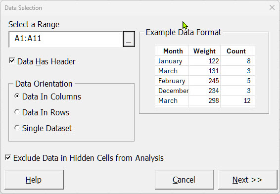
-
Select your data
Select cells A1:A11 (the header row plus all 10 data rows).
-
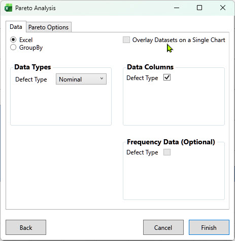
Configure the analysis
In the Pareto Analysis dialog:
- Data Columns: "Defect Type" should be checked
Quantum XL automatically selects the single provided data column, so you don't need to change any options. Click Finish to generate the chart.
Result
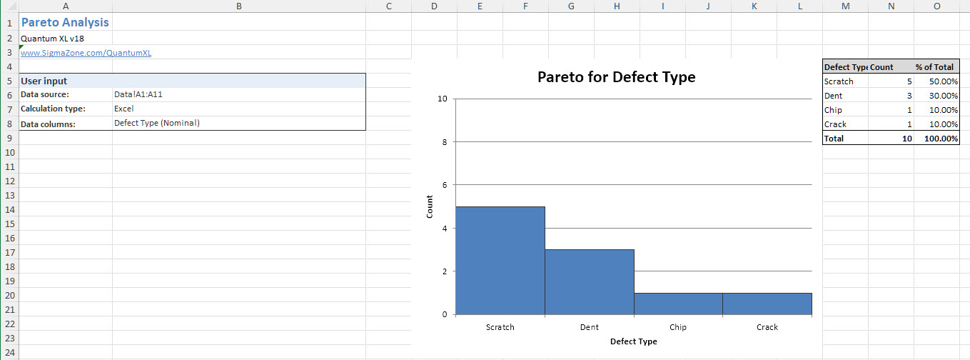
Quantum XL creates a Pareto chart showing defect types sorted by frequency. The chart reveals that Scratch is the most common defect (5 occurrences), followed by Dent (3), with Crack and Chip tied at 1 each.
More Examples
Ready for more? See these variations:
- Multiple Categories — Drill down with two or more category columns
- Count Frequency — When your data is pre-aggregated with counts
- Continuous Frequency — Weighted analysis like cost per defect
- GroupBy — Compare segments side by side