Home / Statistical Tools / Analysis Tools / Time Series / Moving Average
Moving Average
From Excel click...
QXL Stat Tools Tab > Analysis Tools > Time Series > Moving Average
The moving average chart will smooth your data by averaging the last N data points in the series. The moving average chart is typically not used with seasonal data. The example below uses the Home Run Rate from Major League Baseball. You can download this dataset here. This dataset has the Home Run rate from 1871 to 2013. The Home Run Rate is calculated as the number of home runs divided by the number of at bats. For help interpreting the chart, see Understanding the Moving Average Chart.
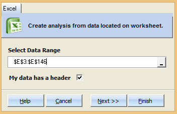
Step #1: Select data source for Analysis.
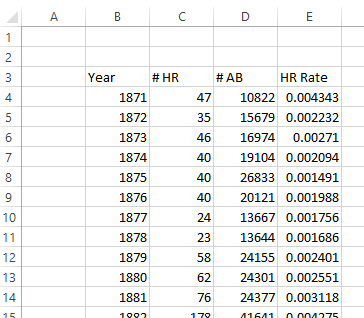
The first few rows of the dataset are below.
Step #2
From Excel click...
QXL Stat Tools Tab > Analysis Tools > Time Series > Moving Average
Step 3: Select the data range which contains your data.
Step 4: Choose Model Type and Forecast Units.
The moving average is the number of points which are averaged to create the plot. The number must be an integer greater than 1.
Step 5: Press Finish. Quantum XL will complete the analysis.
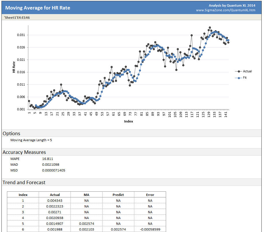
Plot Area: Quantum XL will plot the "Actual" series which represents the original data (without averaging). The "Fit" series represents the data smoothed by averaging the data.
Options: Quantum XL will display the Moving Average Length.
Accuracy Measures: See Time Series Measures of Accuracy
Trend and Forecast: For each data point, Quantum XL will provide the actual value, predicted, and the error in the prediction.
See Also
The data used in the article comes from www.seanlahman.com.