Home / Statistical Tools / Analysis Tools / Boxplot
Boxplot
From Excel click...
QXL Stat Tools Tab > Analysis Tools > Boxplot
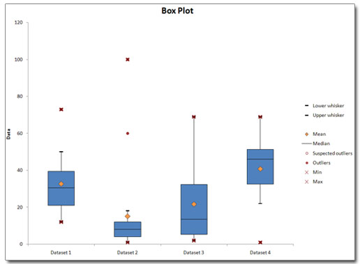
The Boxplot is graphical representation of the distribution of a set of data. It is also known as a box and whisker diagram.
Default settings for a Boxplot are:
- The box represents interquartile range - IQR (bottom and top of the box are the 25th and 75th percentile), and the band inside the box is the 50th percentile (the median).
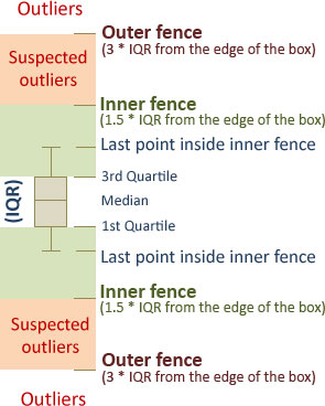
- Whiskers end at the last point inside the inner fence, where inner fence represents the 1.5 IQR from the edges of the box.
Boxplot elements
| Symbol | Description |
|---|---|
 |
Outliers are represented with a full circle on a boxplot. They are data points beyond the Outer fence (3 * IQR from the edge of the box). |
 |
Suspected Outliers are represented with an empty circle on a box plot. They are data points beyond the Inner fence, but not beyond the Outer fence. Inner fence is at 1.5 * IQR from the edge of the box. |
 |
Dataset Mean is represented with a diamond sign. |
 |
Dataset minimum and maximum are represented with an 'X' sign. |
Step #1: Select data source for Boxplot
Data for the Boxplot can come from an Excel spreadsheet or SQL data source. See source data formats.
Step #2a: Boxplot standard options
Standard options allow you to change chart titles and select which elements you want to display on a Boxplot.
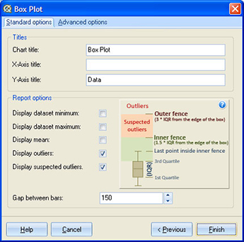
You can choose to show outliers, suspected outliers, mean, and dataset minimum and maximum value.
'Gap between bars' setting controls the width of the box.
Step #2b: Boxplot Advanced options
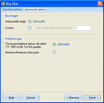
Box height represents the interquartile range (75th percentile minus 25th percentile). This can be changed by selecting 'Custom' option, and entering value between 5 and 45 in the text box. If you enter a value of '10', then the box height will be equal to the 90th percentile minus the 10th percentile.
By default, whiskers end at the last data point still within 1.5 * IQR from the edge of the box. You can choose to extend whiskers up to the minimum / maximum data points.
Step #3: Plot order
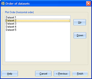
Control the layout of the boxes. Boxplots will be plotted from left to right on the chart as they are ordered in the plot list, starting from top to bottom. Use 'Up' and 'Down' buttons to move boxes to a desired position.
Update
Boxplot chart is updatable. After you create a Boxplot, you can change its settings, change the data source, or add new data to the data source and simply update the chart.
- Update Boxplot chart: Quantum XL > Statistical Tools > Update Sheet
- Change settings: Quantum XL > Statistical Tools > Modify Chart/Analysis
- Change data source: Quantum XL > Statistical Tools > Change data source
Boxplot Example